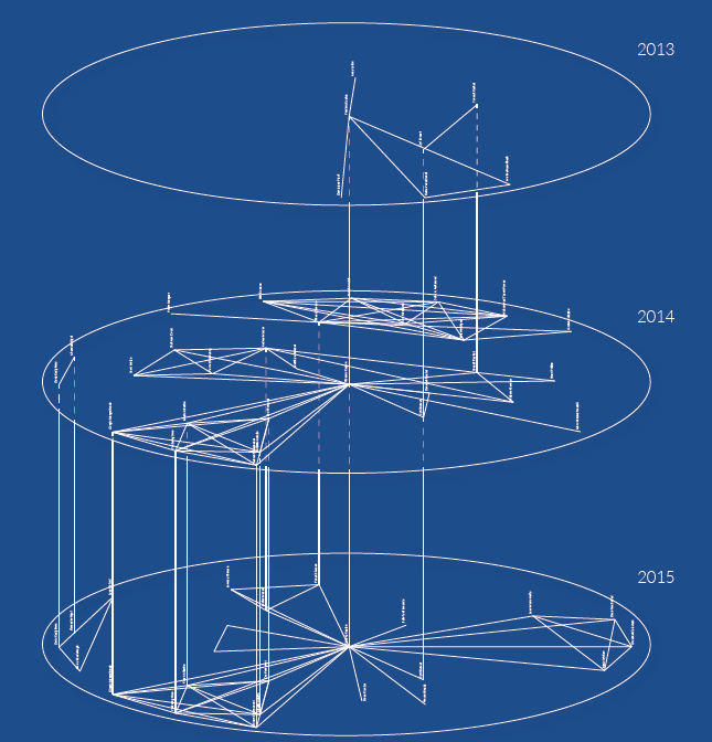
♦ The Trajectories Tool. Developing new forms of data visualisation based on temporal networks. See paper here for DH2016 conf., slides here, a poster here, and a web experimentation here. All this works have been done in collaboration with Dario Rodighiero and Alexandre Rigal (PhD students, EPFL, Switzerland).
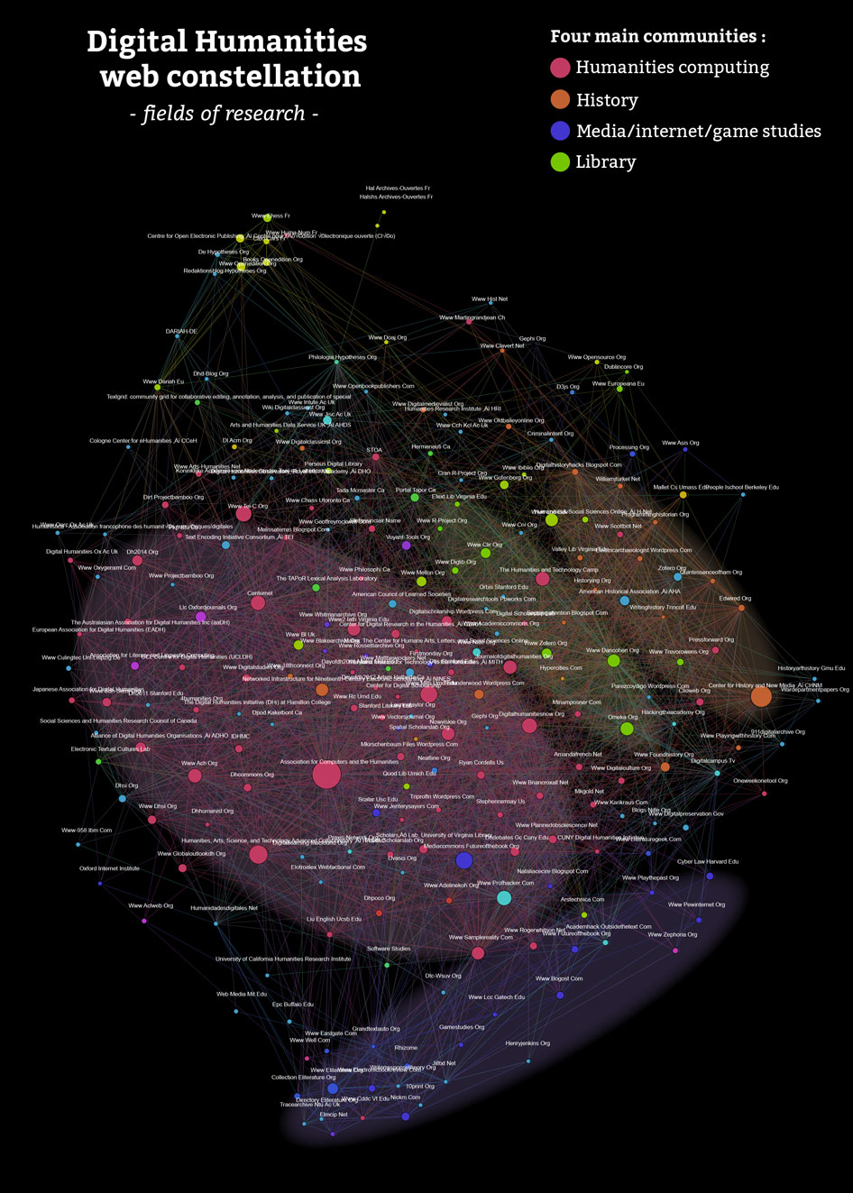
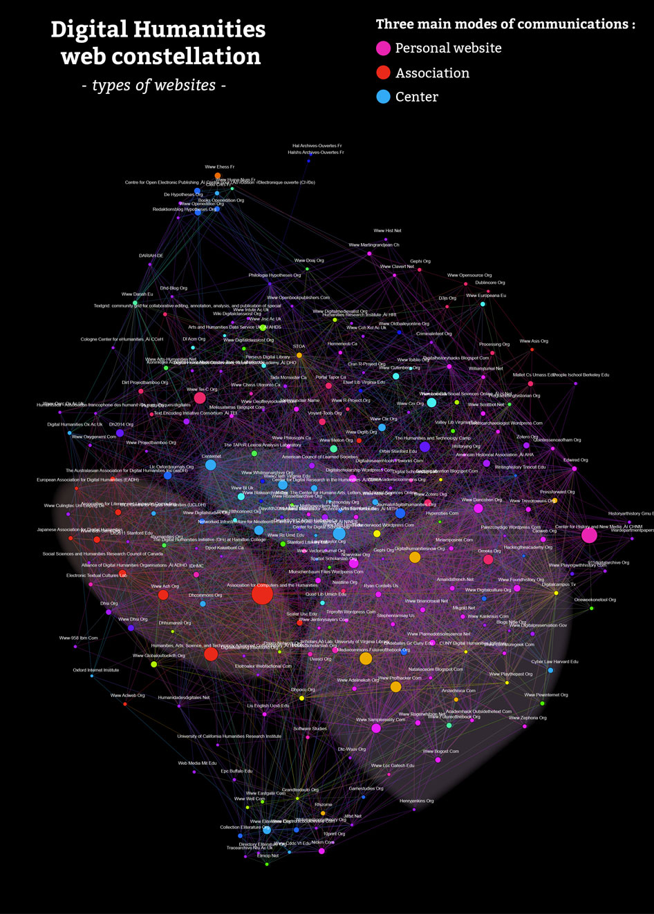
♦In August 2014, I designed a web mapping of the digital humanities worldwide community using the web-crawler hyphe and the visual network analysis software, Gephi. See images below. The cartographies are made of the two hundred most importants websites of the community ranked by popularity (number of incoming links per website) based on a corpus of eight thousand websites. The project shows the main communities and their major modes of communications. Download the RAW images here and here. I am right now looking for other ways to map the digital humanities : text-mining on publications, 3D vizs…